Clients
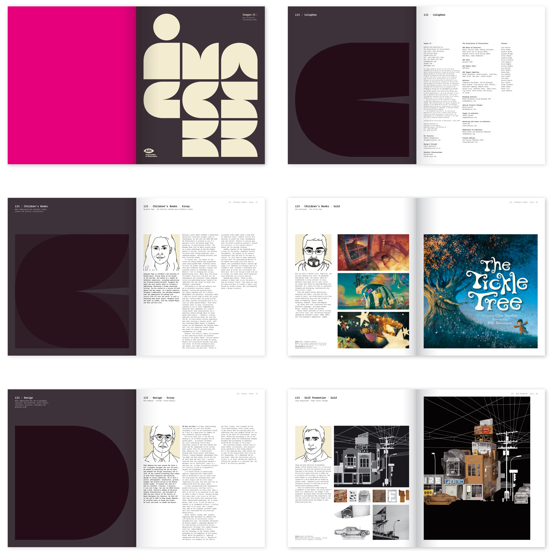
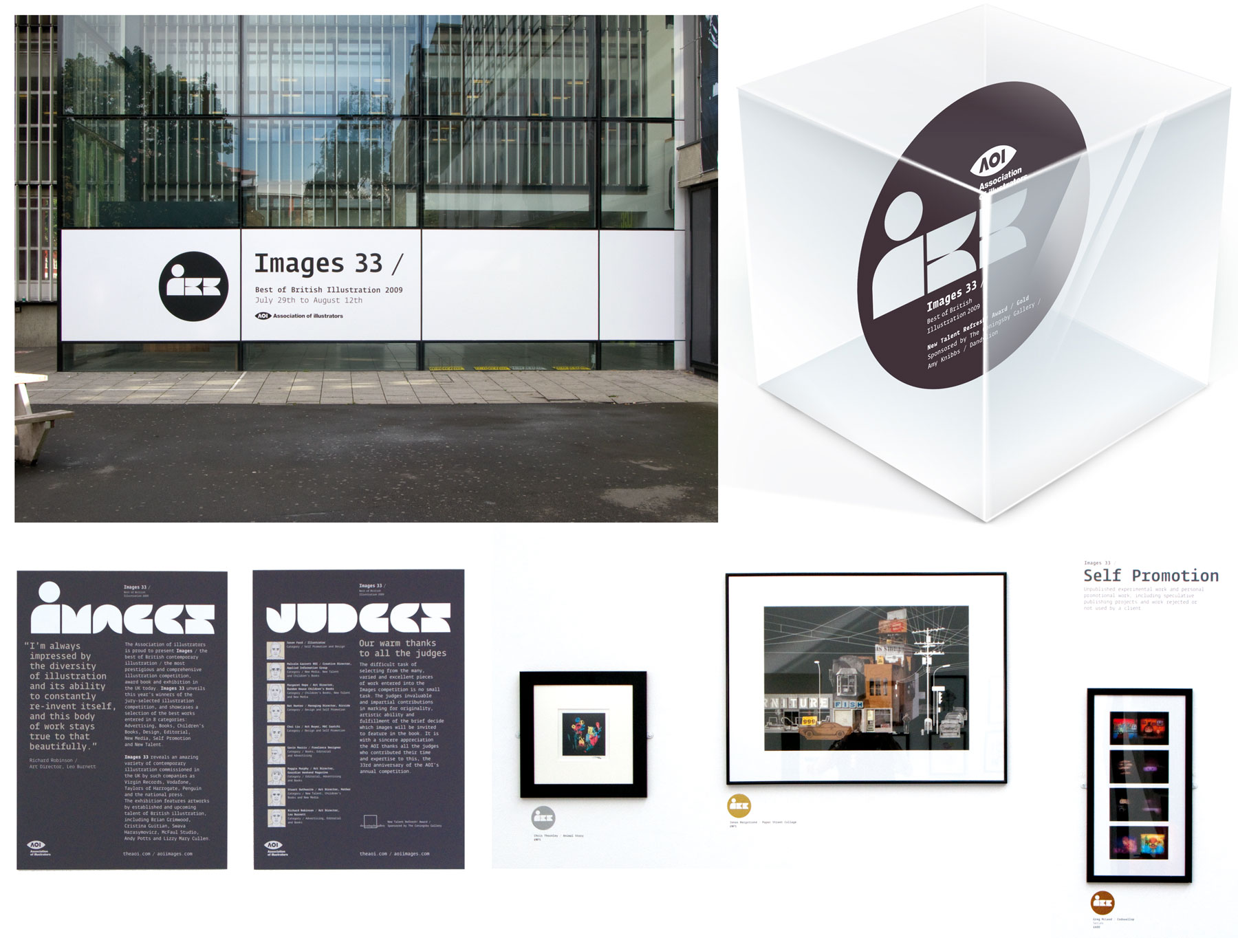
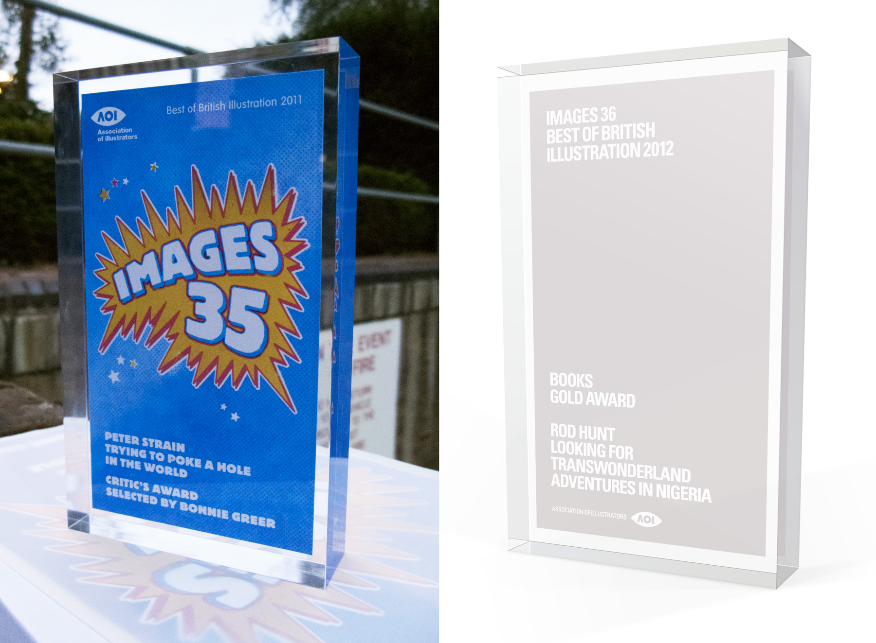
Association of Illustrators
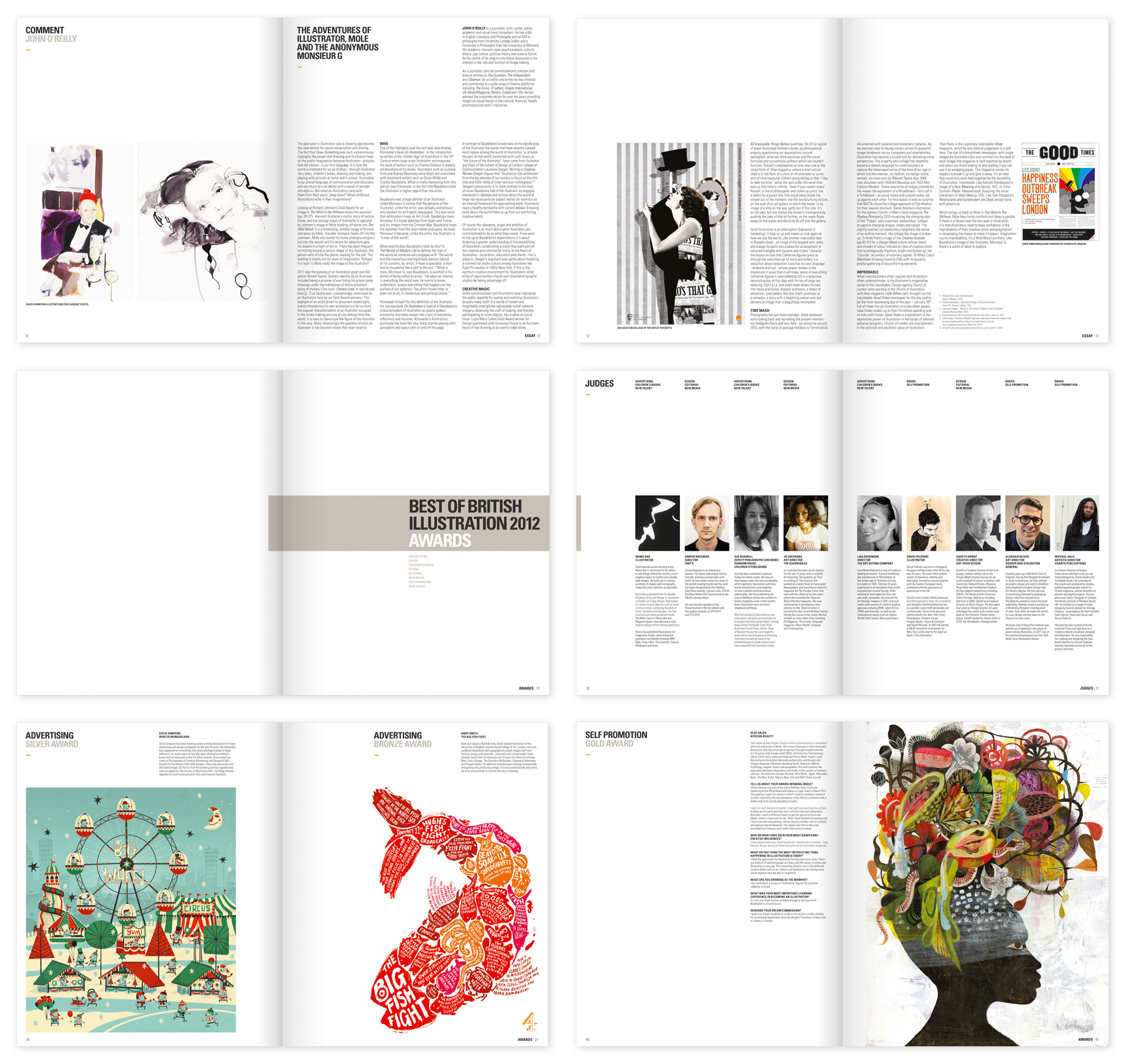
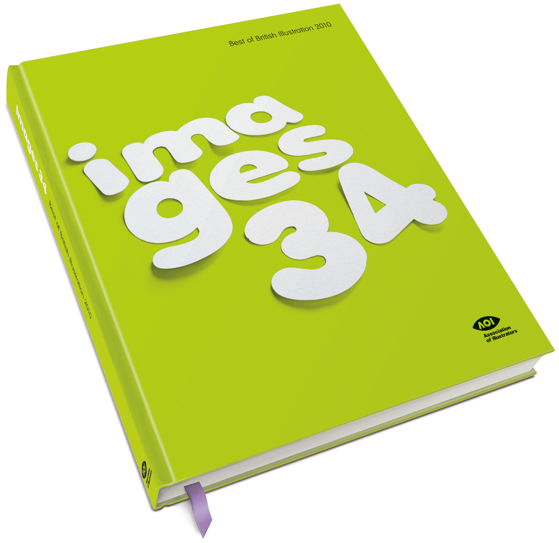
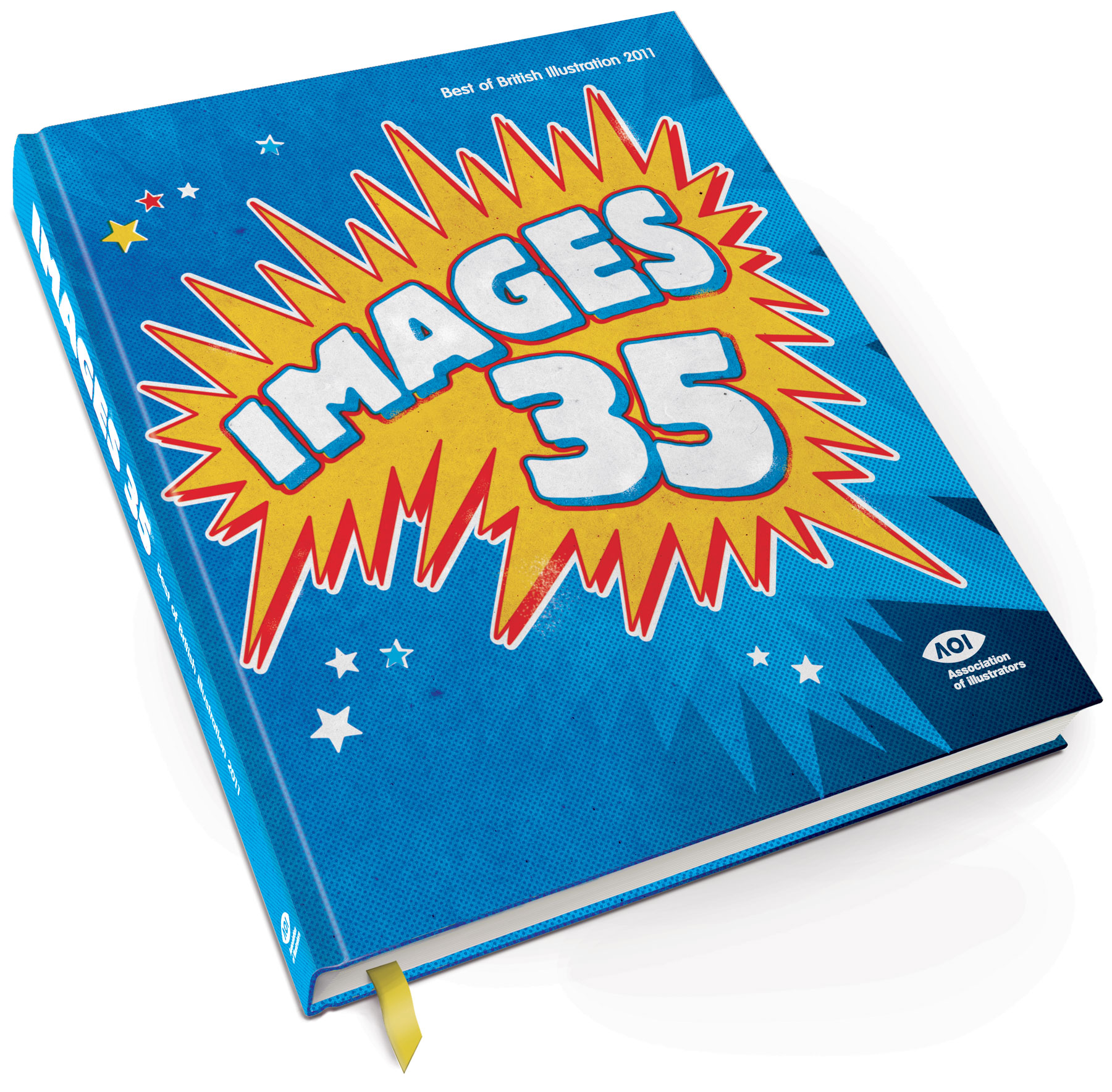
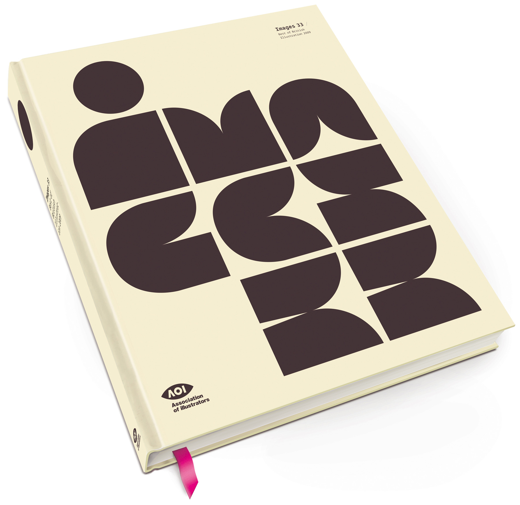
Images Awards book and exhibition graphics
I was given the brief to design the yearly Images Awards for the Association of Illustrators, Each year needed to have it's own distinctive look that followed through from the book to the awards ceremony and exhibition graphics.
Most years I did this alone working closely with their team, however one year Adrian Shaughnessy was brought in as Art Director.
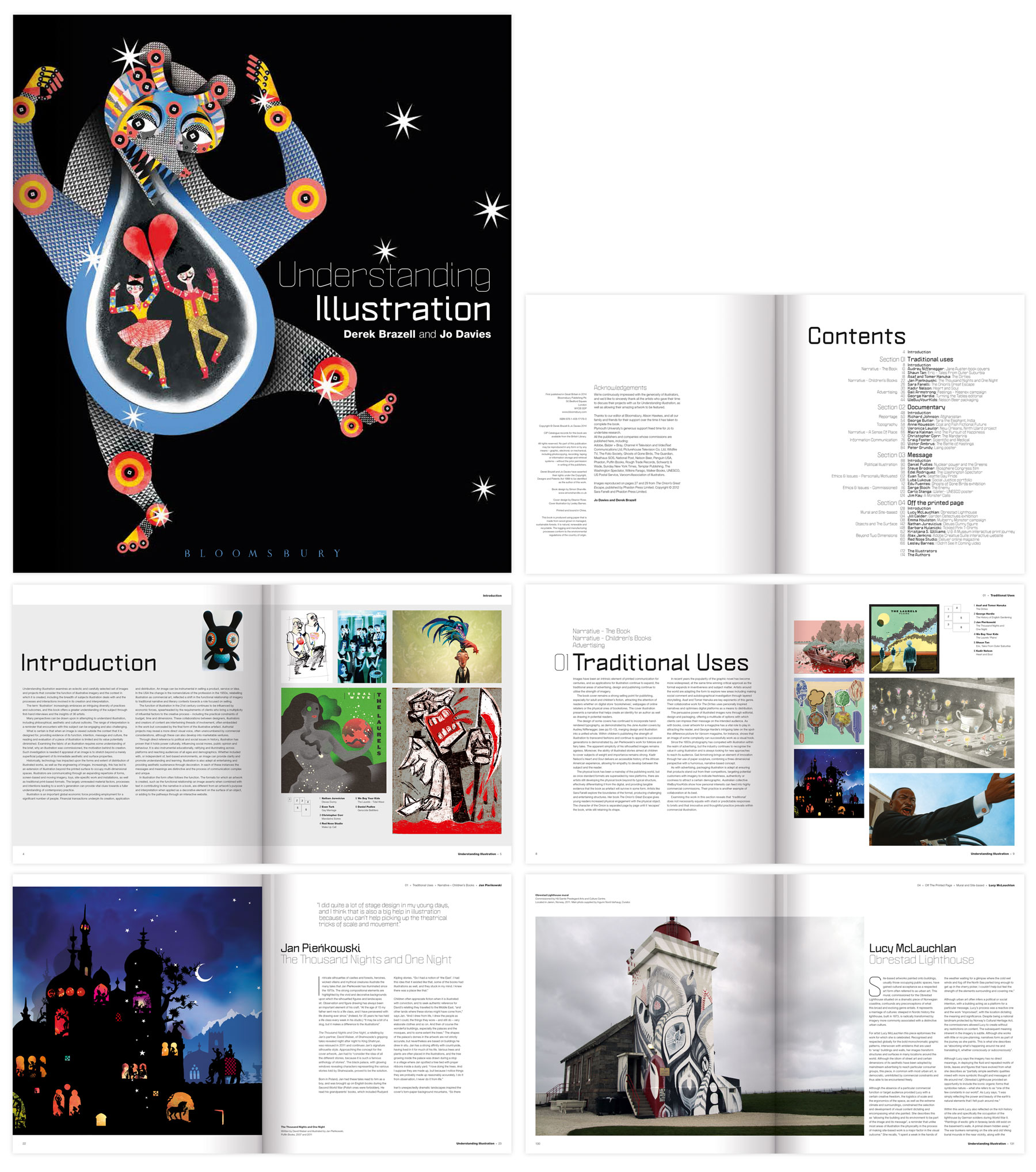
Bloomsbury
Images Awards book and exhibition graphics
I'm really happy to be involved in this project. Understanding Illustration Written by Derek Brazell and Jo Davies, Published by A&C Black and Bloomsbury.
As designer I wanted to create contemporary and well structured book, that is easy to navigate and read, that shows off the Illustrations to their best and sits well among the many design and illustration books out there in the market.
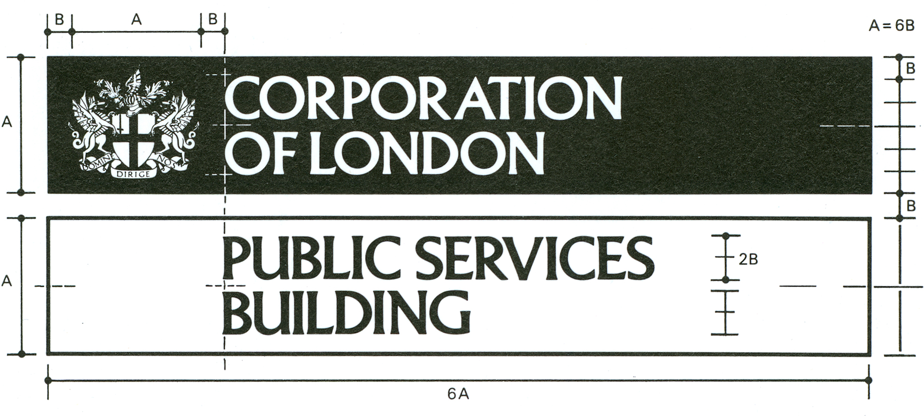
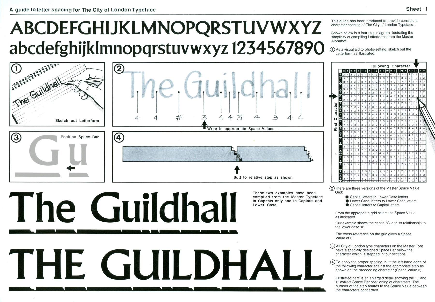
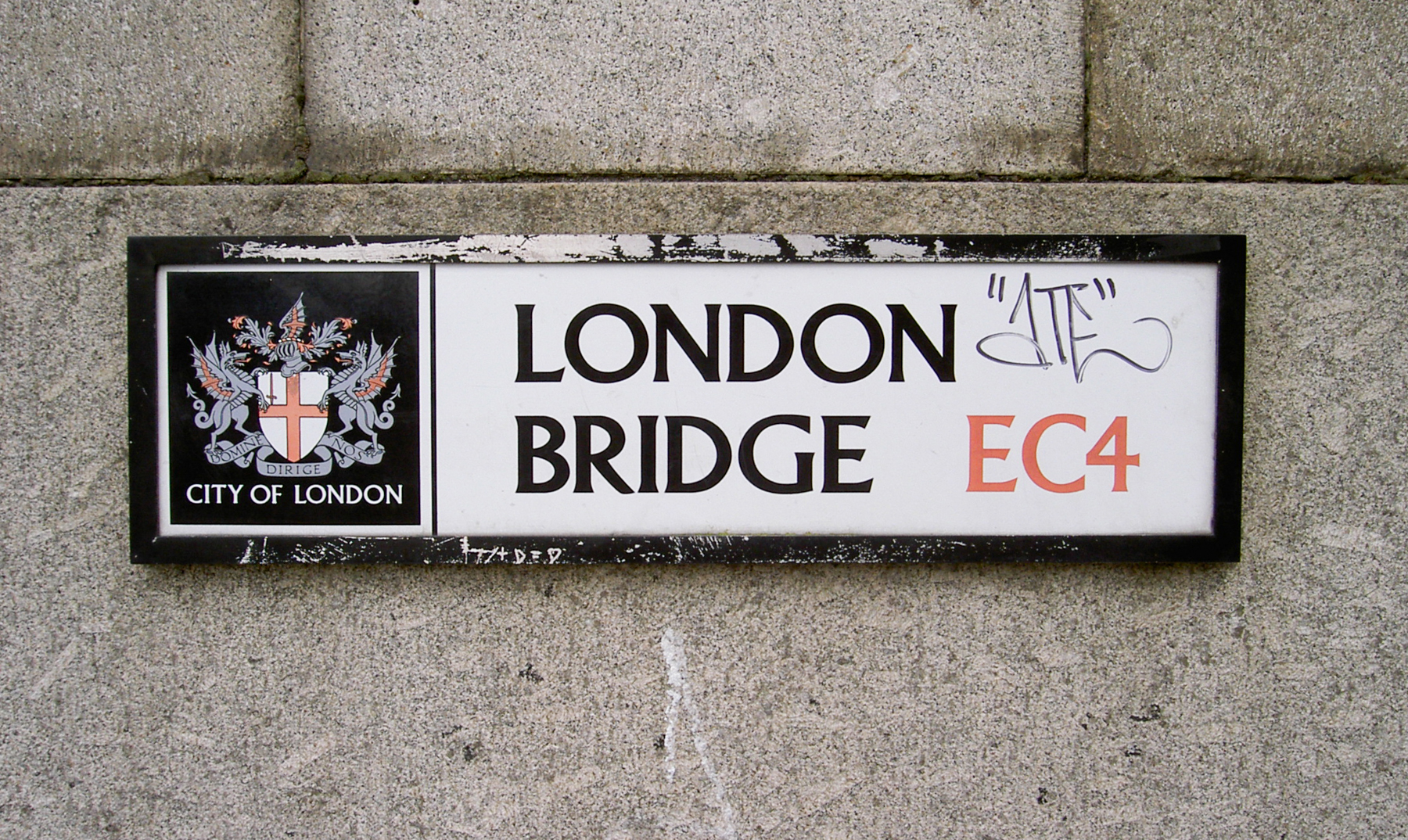
Corporation of London
Street Signage System
Early in my career I was involved in helping to create a street signage system for the City of London. We had a typeface cut and we created a letter spacing system. This system used a cross reference chart where each character used 1 of a 4 step space bar relating to the character before it. By using this system all the signage across the City would have a consistency regardless of who created it.
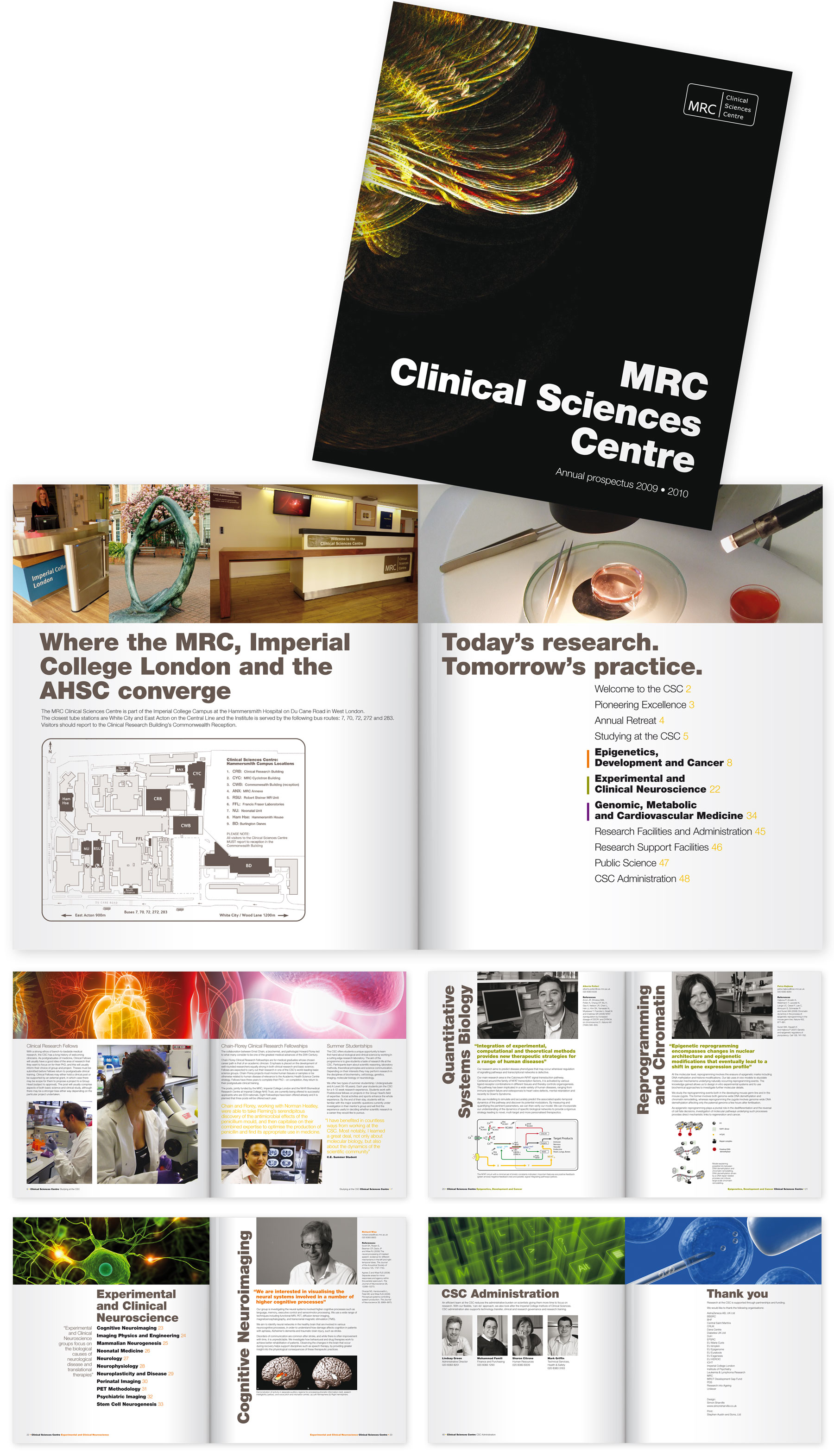
Clinical Science Centre
Annual Prospectus
Annual prospectus design for the Clinical Sciences Centre. Promoting the Centre to potential students. The brief was to create a clear and strong design that allowed for a lot of information with footnotes and diagrams but that each subject page must be identical in layout. I created a hierarchal grid that allowed for different lengths of title and content but using a different key colour relative to their section.
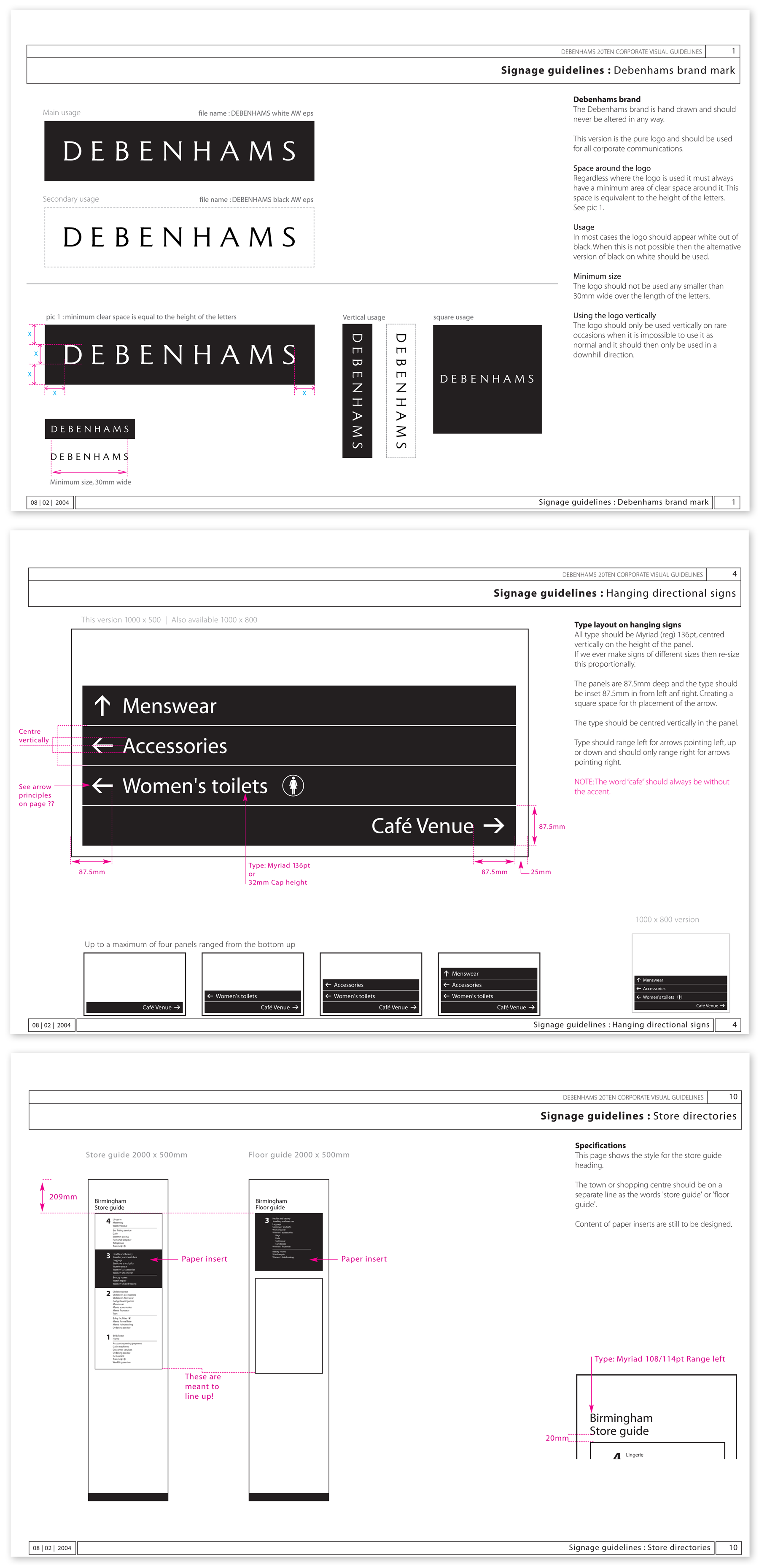
Debenhams
Brand Identity and Signage
As a key member of the in-house design team, it was my role to look at evolving the branding of the company. We decided to remove the existing blue used throughout the stores and make the brand, signage and any other material, black and white. We introduced a new typeface and implemented that across all signage and ticketing.
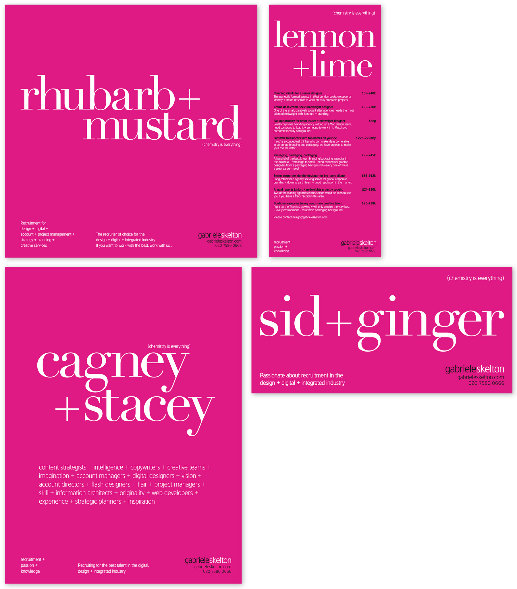
Gabriele Skelton
Recruitment Ads
Part of a large range of display and recruitment ads designed for Gabriele Skelton.
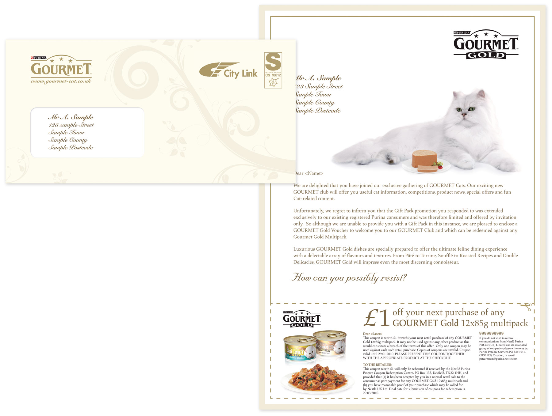
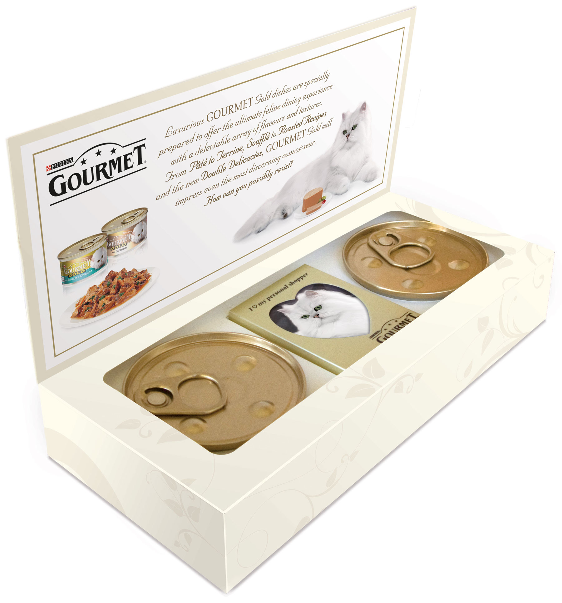
Gourmet Cat Food
Promotional Mailout
A small selection of Direct Mail and Customer Invites designed for Gourmet Cat Food.
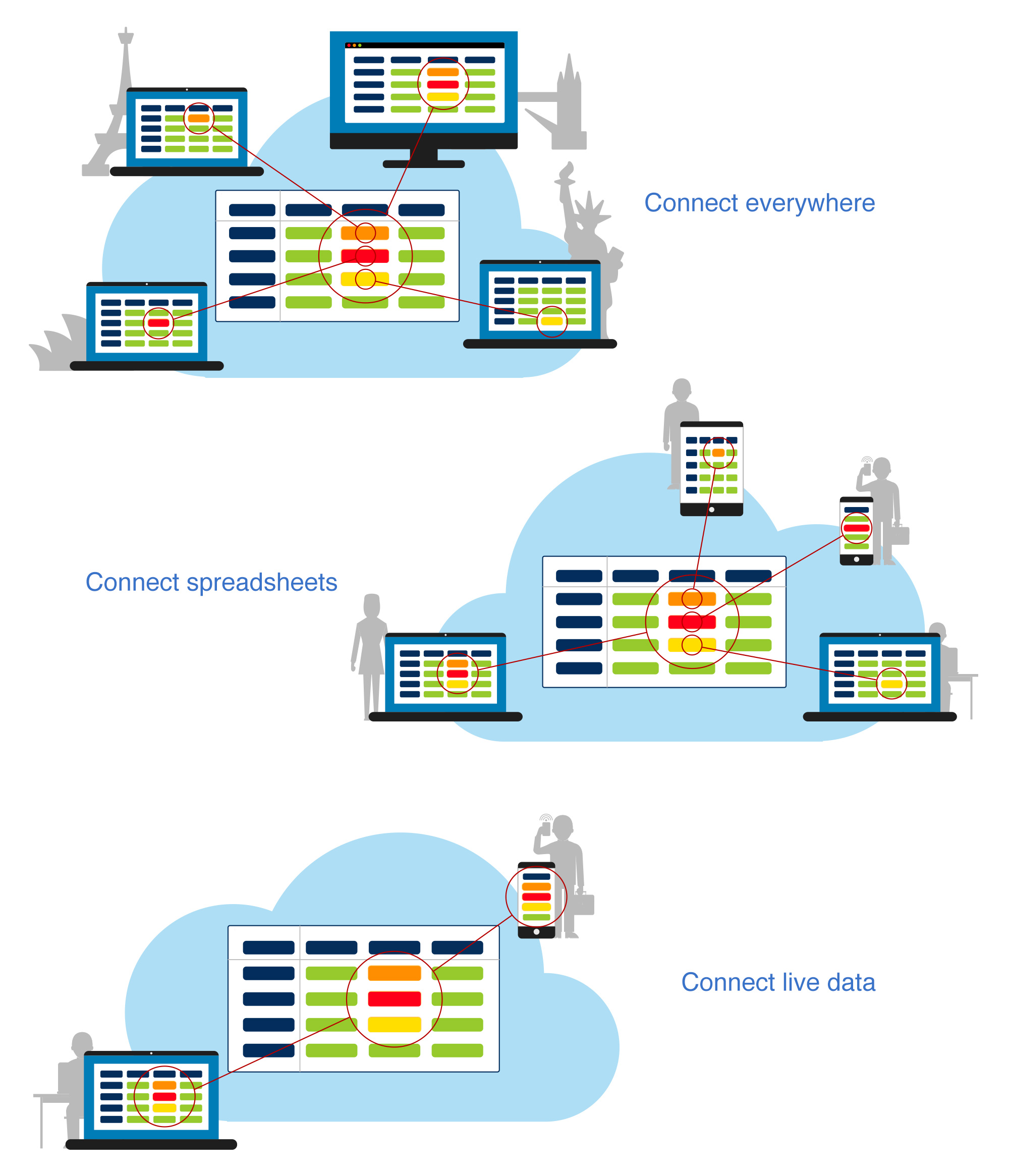
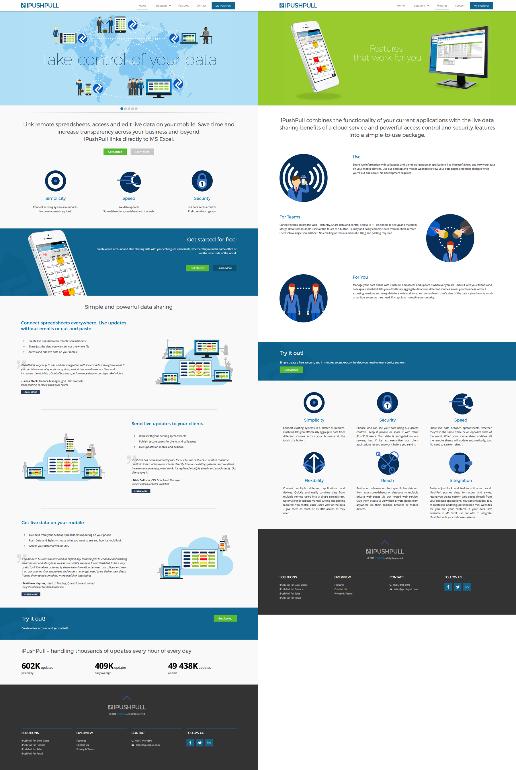
iPushPull
Website and icon designs
I was commissioned to create a range of icons and illustrations, then review the look of their existing website and show how these could be implemented.

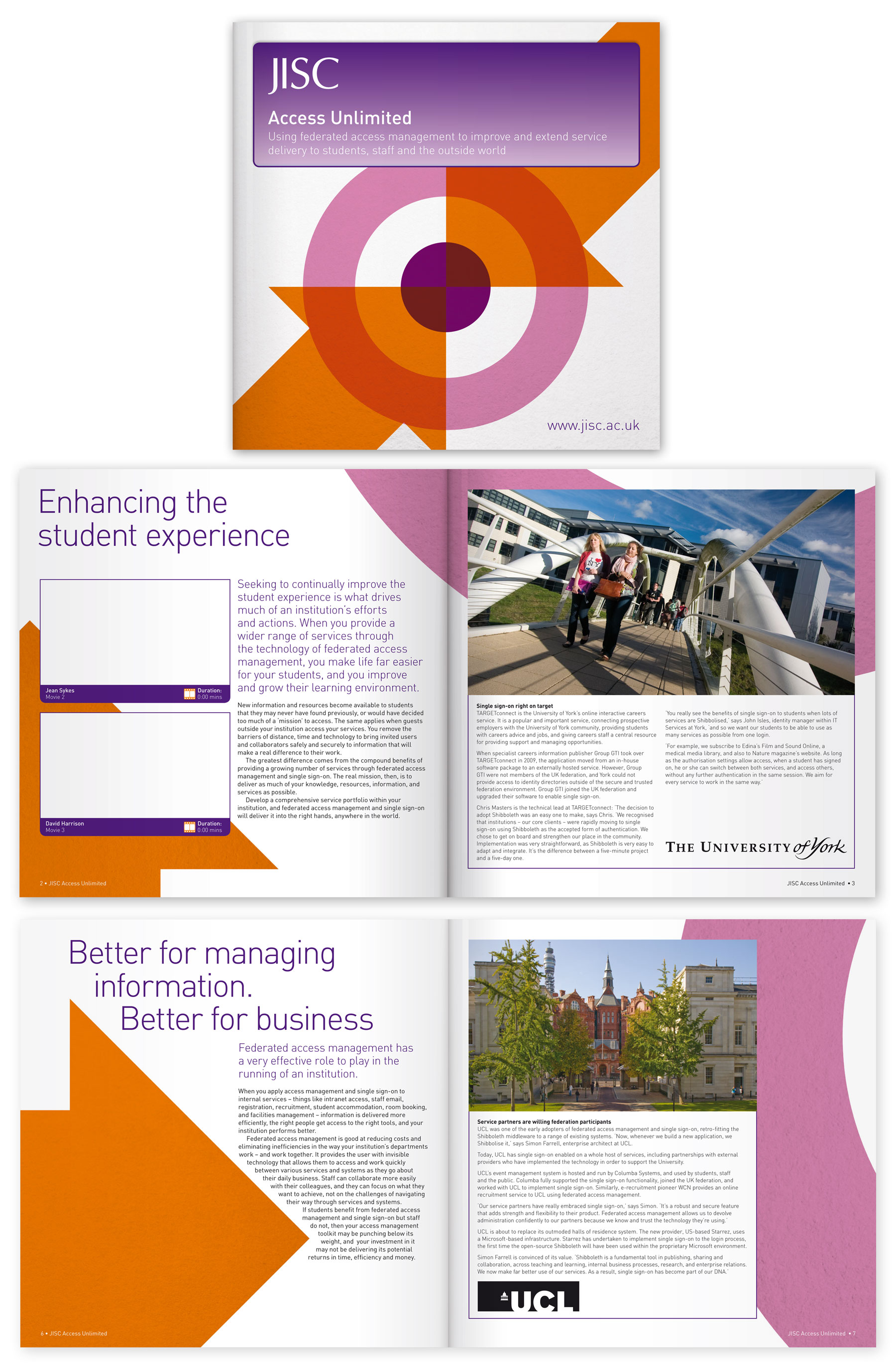
JISC
JISC Access Unlimited Brochure
Designs for an interactive brochure to demonstrate the benefits of UK colleges and universities becoming a service provider in the UK federation, streamlining and delivering access to institutional services via secure access management. The design had to look like a printed brochure, but be an interactive PDF containing video. JISC had very tight design principles, the structure had to be identical to other brochures they had produced, but the type, colours and graphics could be experimented with.
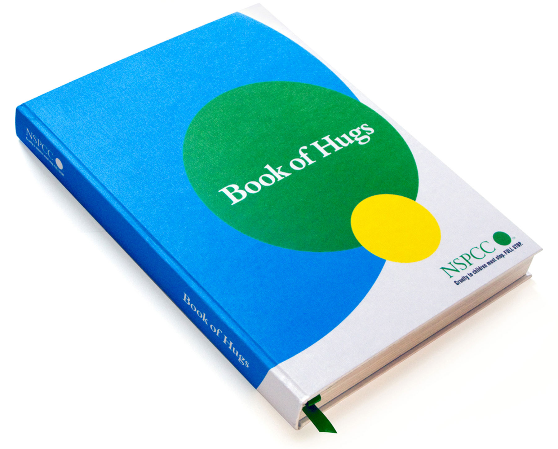
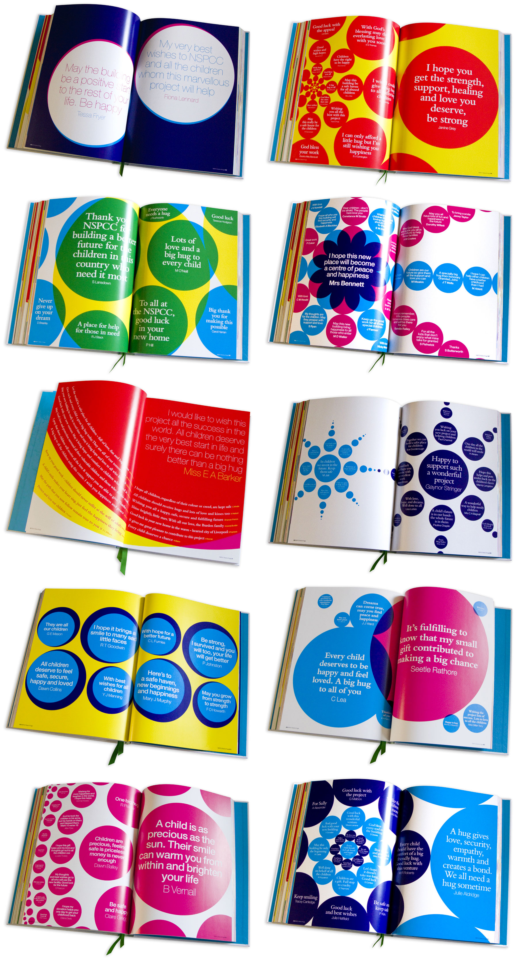
NSPCC
Book of Hugs
I was commissioned through WWAV Rapp Collins to design a book for the NSPCC. A one-off production showing over 4,000 quotes from members of the public. Each spread had to be unique in layout but use only 4 separate colours and be based around circles and the green dot of their logo. The final book was put on display in the foyer of their new flagship office in Liverpool.
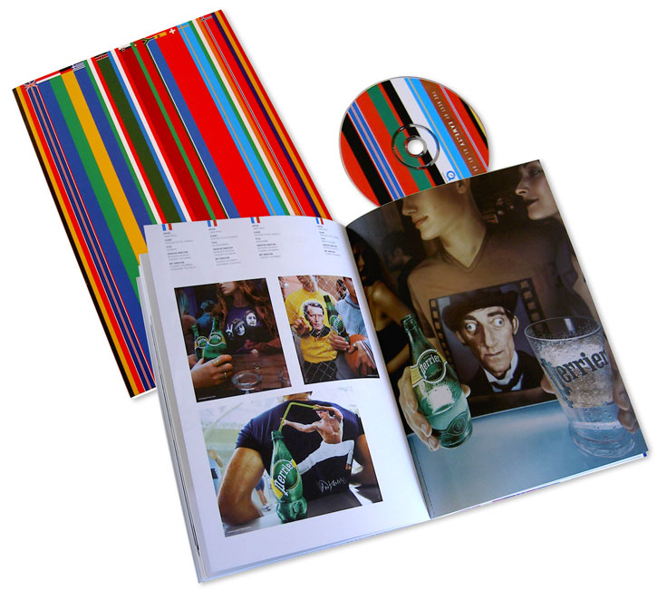
Ogilvy
Yearbook
I worked in-house at Ogilvy with the team behind this book: a comprehensive showcase highlighting a year of the agency's great work from around the world. Sassy, splendid, stripey.
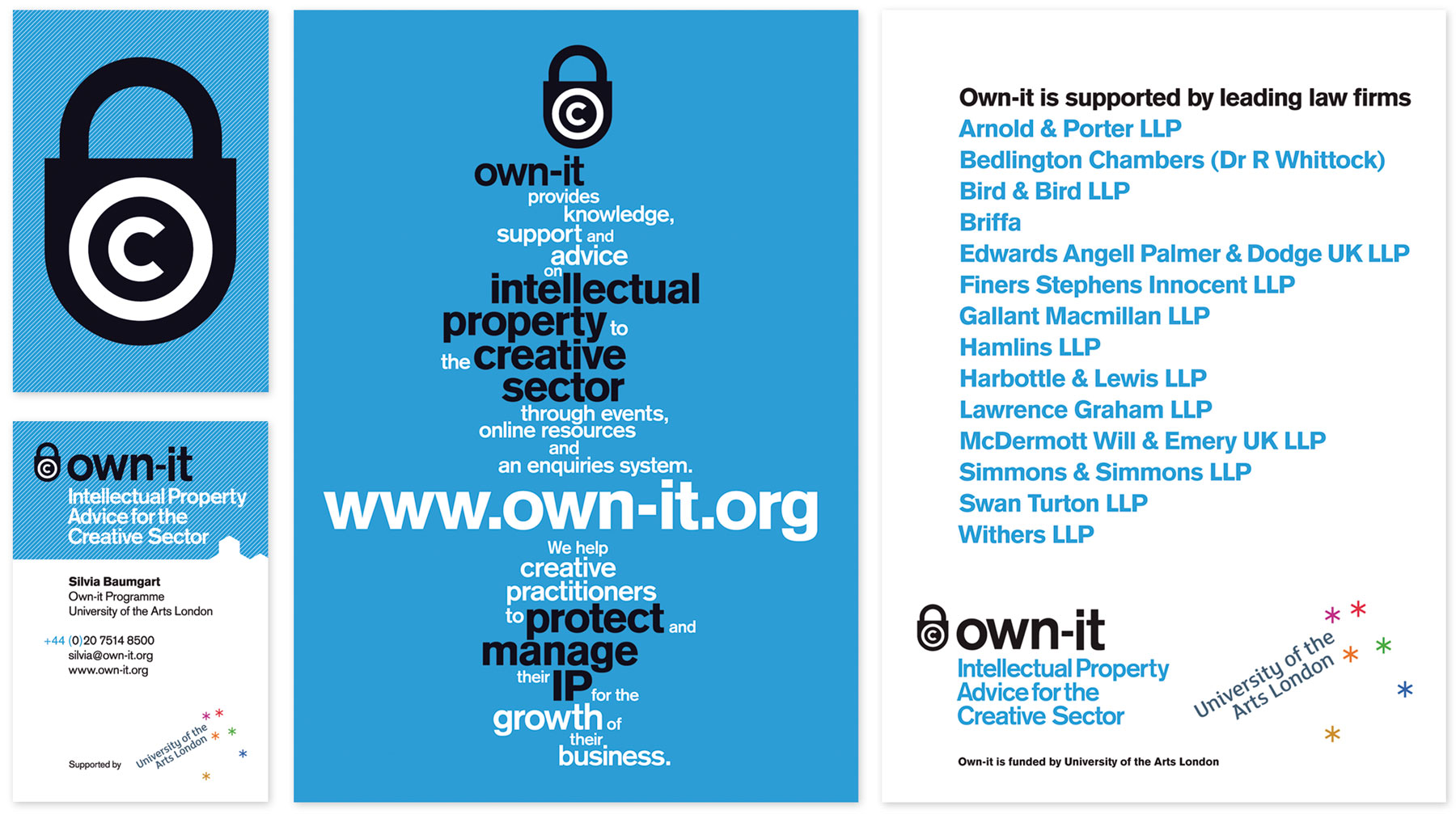
Own-it
Promotional Material
Own-It are an organisation advising the creative sector on their intellectual property rights and part of the University of the Arts London. I was asked to design a new Business Card for them as well as an A5 promotional leaflet.
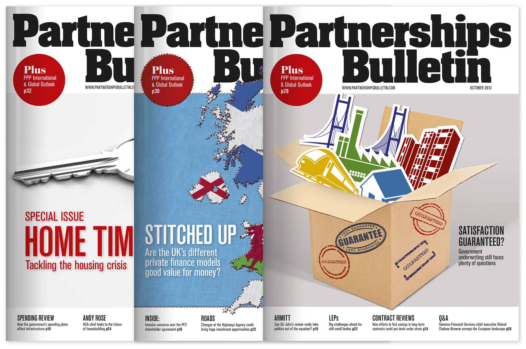
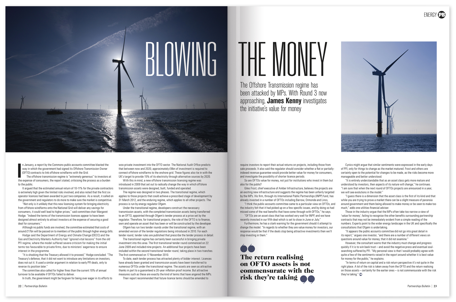
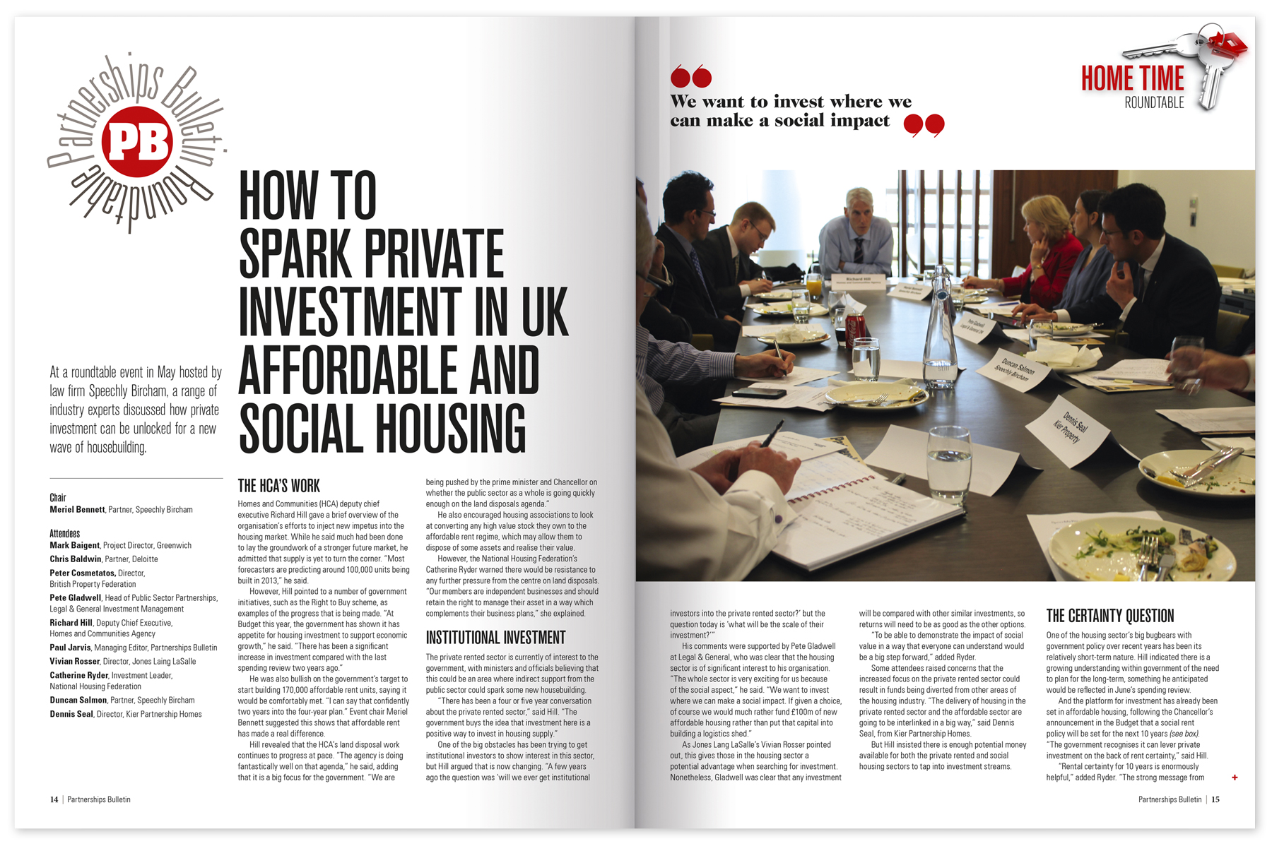
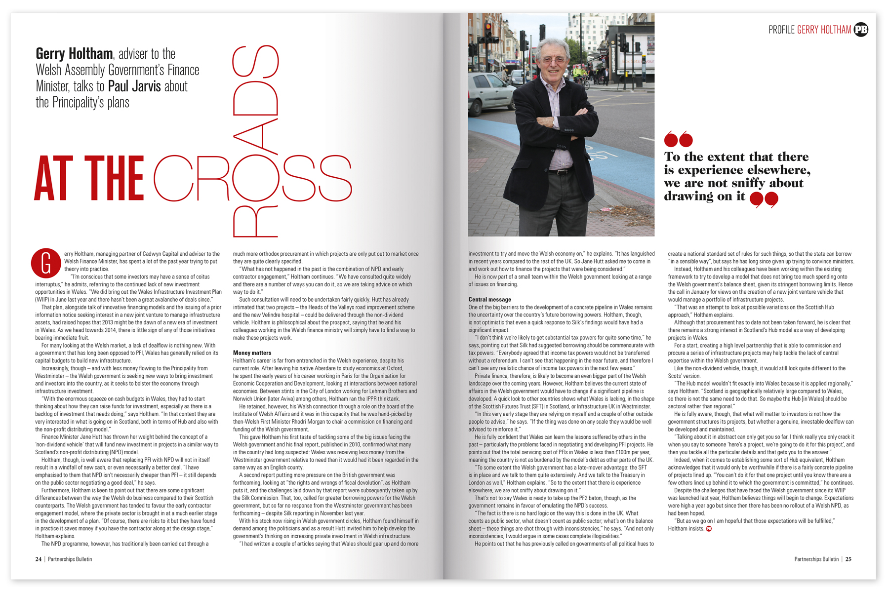
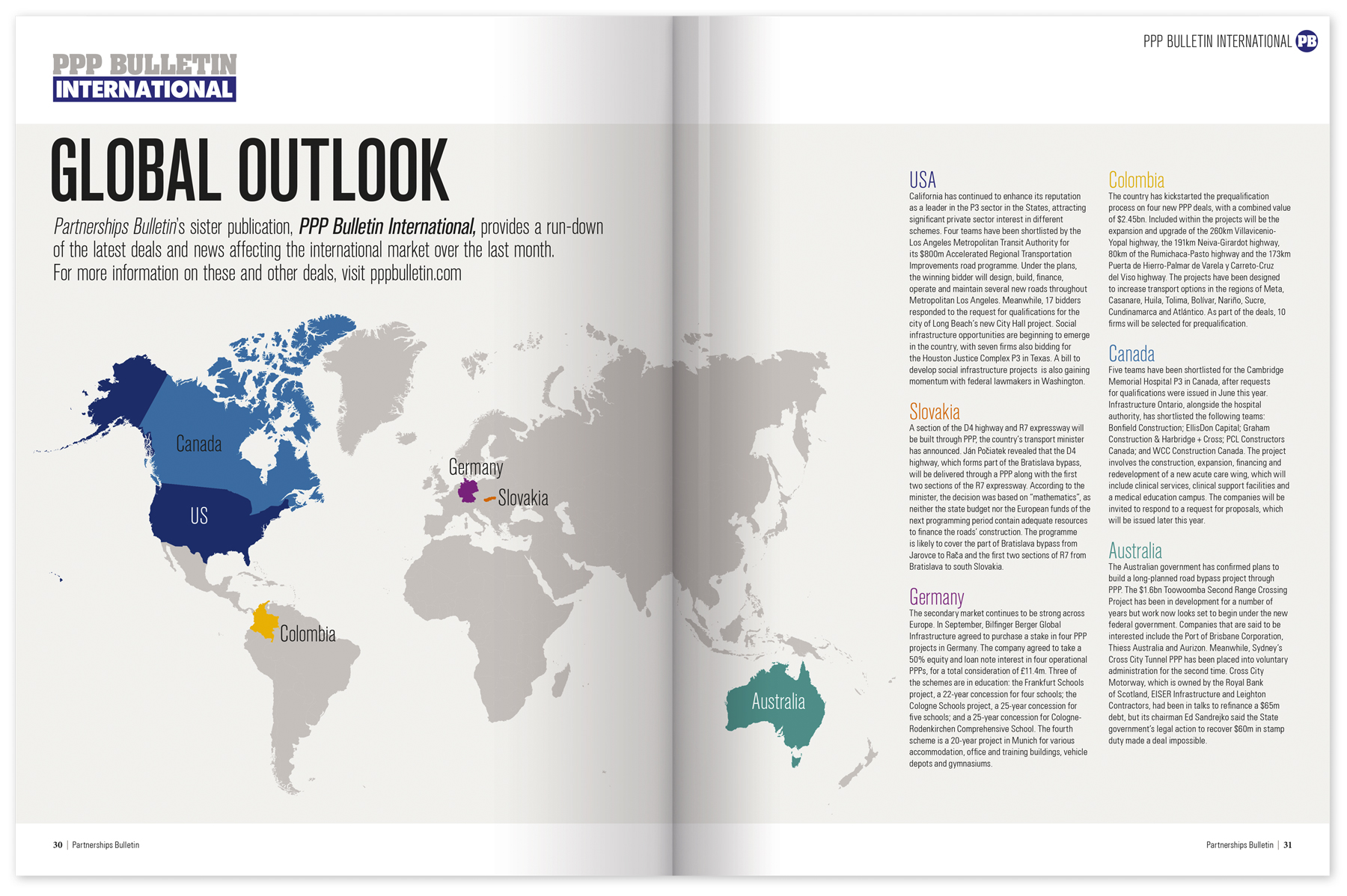
Partnerships Bulletin
Partnerships Bulletin magazine is a subscription based specialist business magazine for the Public Private Partnerships market, The brief was to create a new design with a structured and contemporary feel while keeping the tone serious and business like.
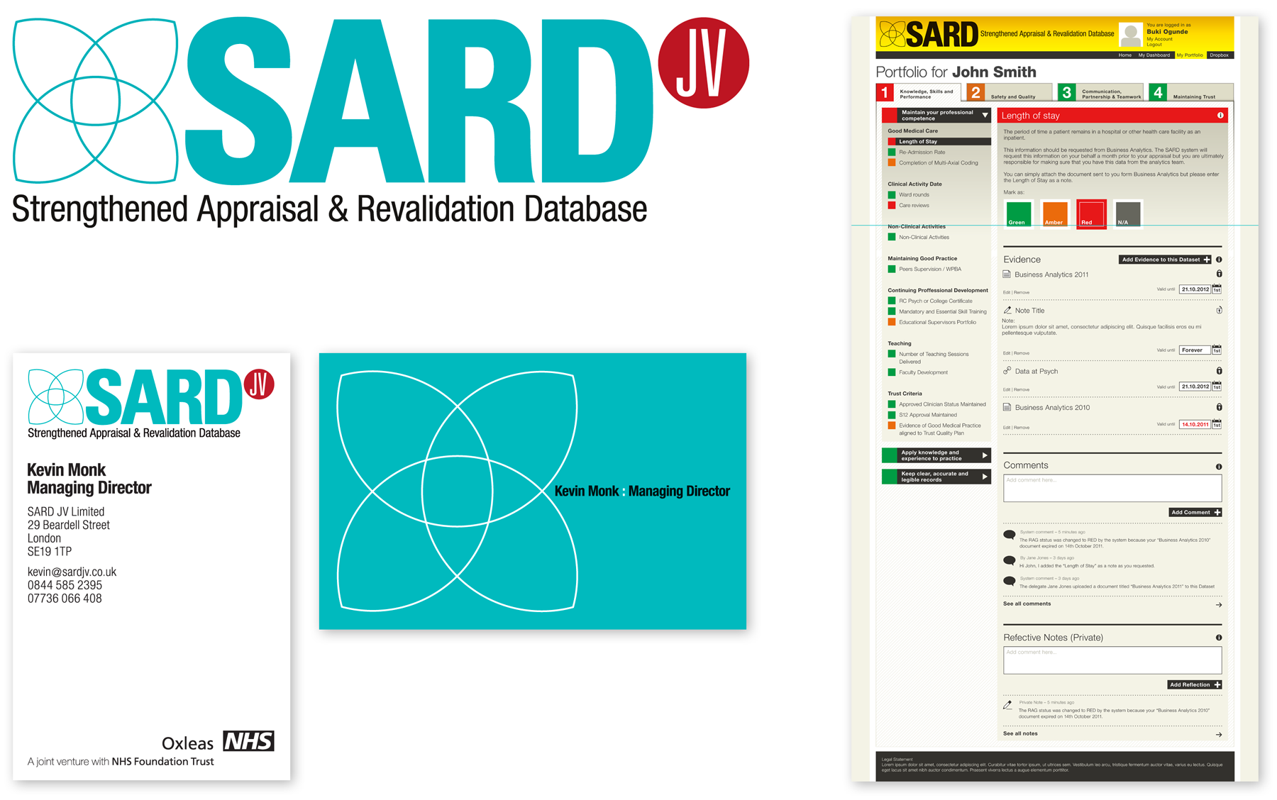
SARD
SARD Identity
SARD is an online appraisal database for a division of the NHS. Working closely with the developers, I created a Brand ID, Business Cards and designed the structural look of their system.
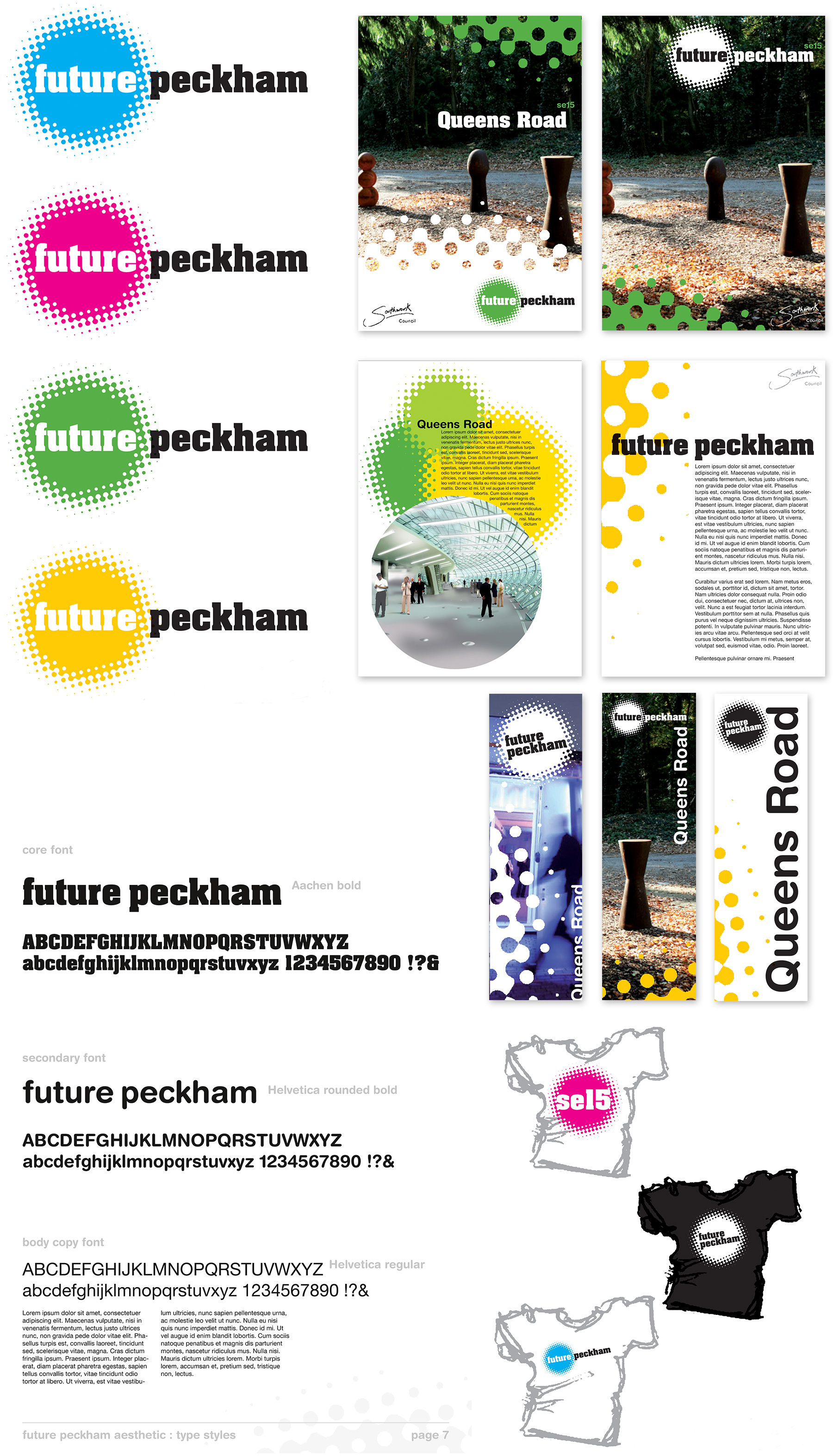
Southwark Council
Future Peckham Identity
I was commissioned by Southwark Council to design some regeneration branding and signage. The brief was an identity to be used across all printed literature and projects related to the area.
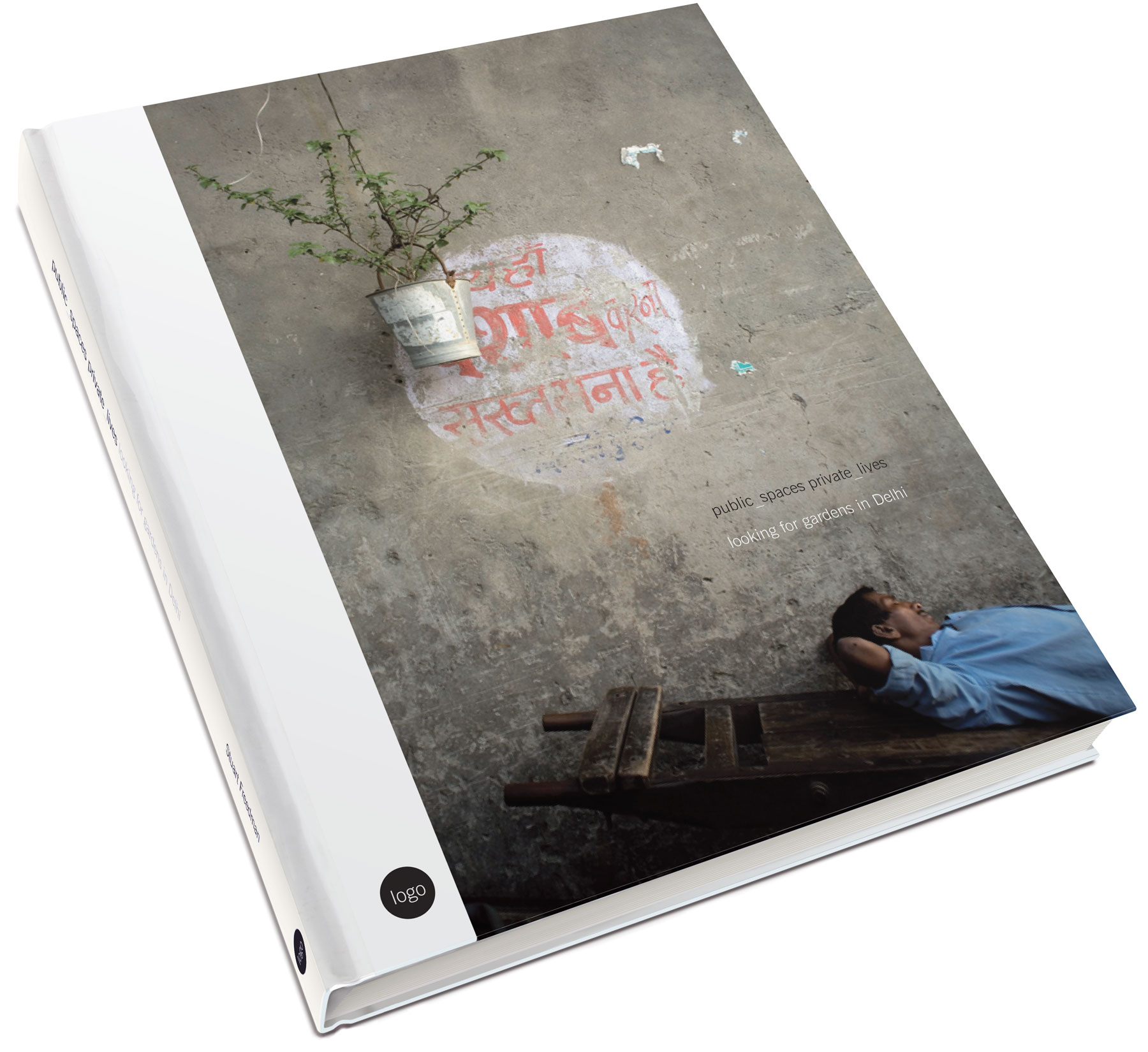
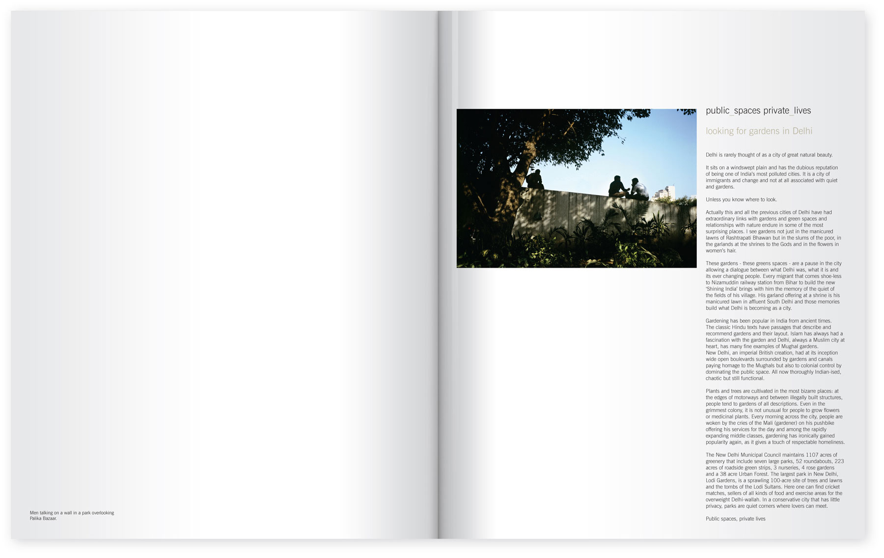
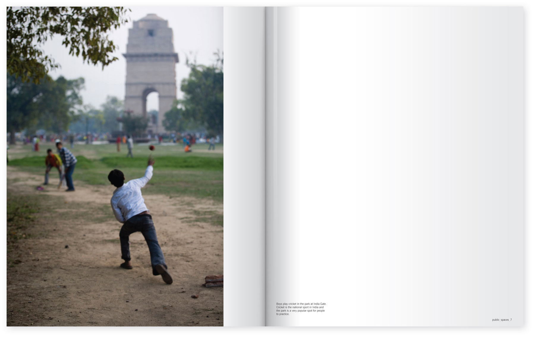
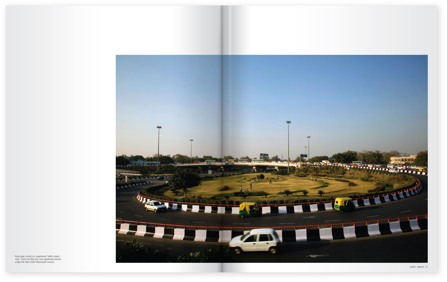
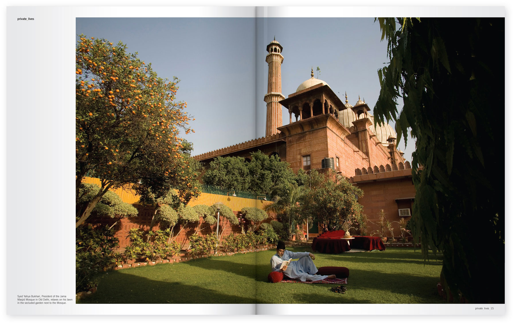
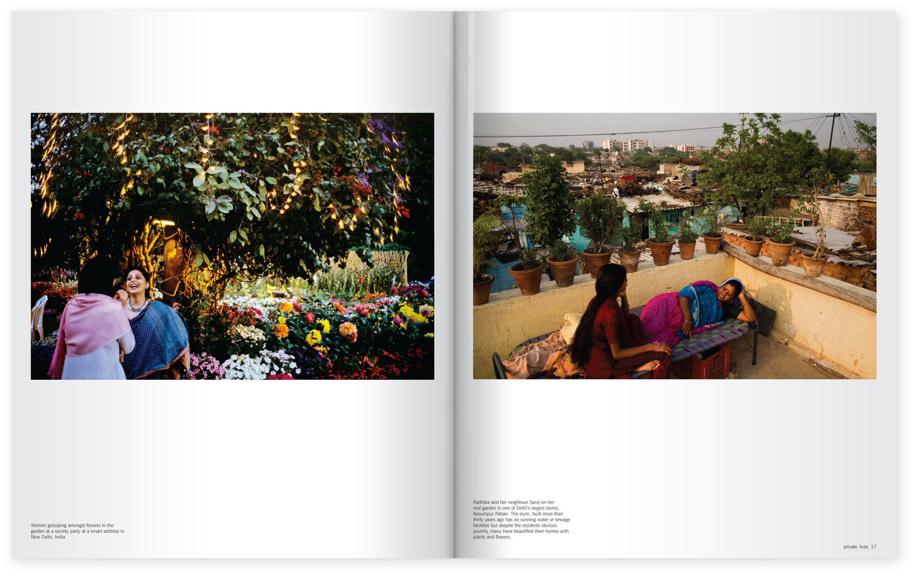
Stuart Freedman
Public Spaces Private Lives
Stuart Freedman is an award-winning photographer and photojournalist whose work has reported, among other events, war in Sierra Leone, famine in Sudan and other conflicts. He also undertakes commissions for organisations, individuals, including portraits, and travel assignments. Stuart's work has been published in Life, Geo, Time, National Geographic, Der Spiegel, Newsweek and Paris Match
Stuart asked me to design the book for his collection of images: public_spaces private_lives. The collection captures the green spaces within the the bustling city of Delhi in India.
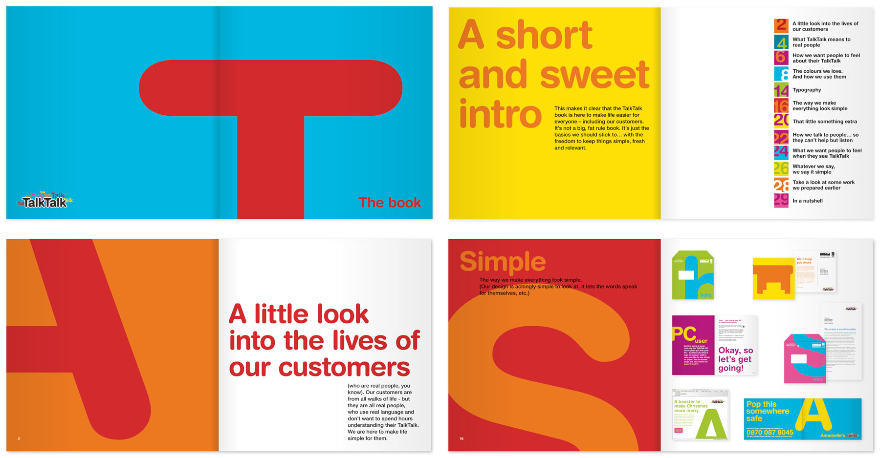
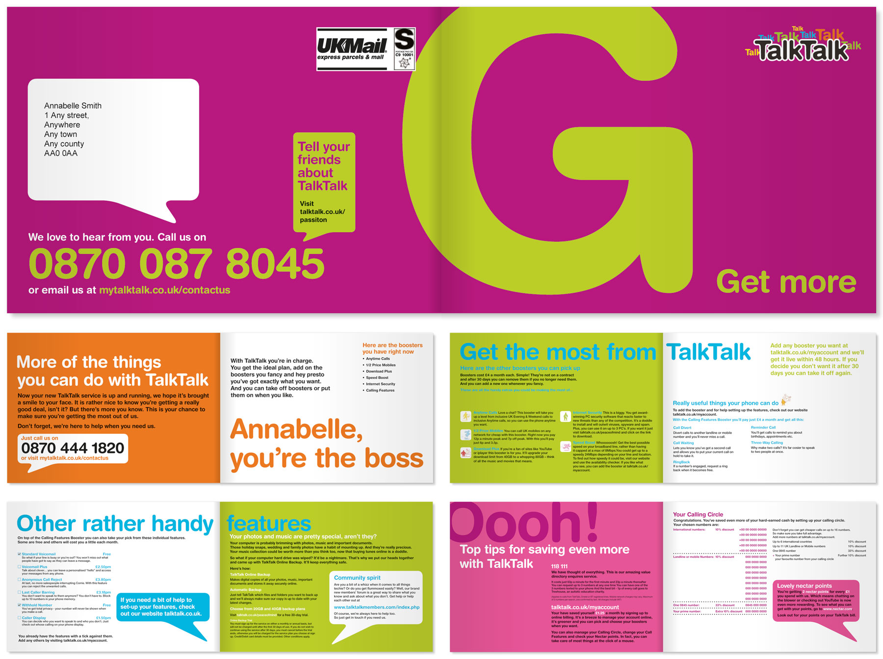
TalkTalk
Guidelines
The TalkTalk guidelines were created for external creative teams to use and were designed to be quite loose in their use, giving them a visual style and language but not being too restrictive.
Welcome brochure
Design for the brochure to welcome new customers.
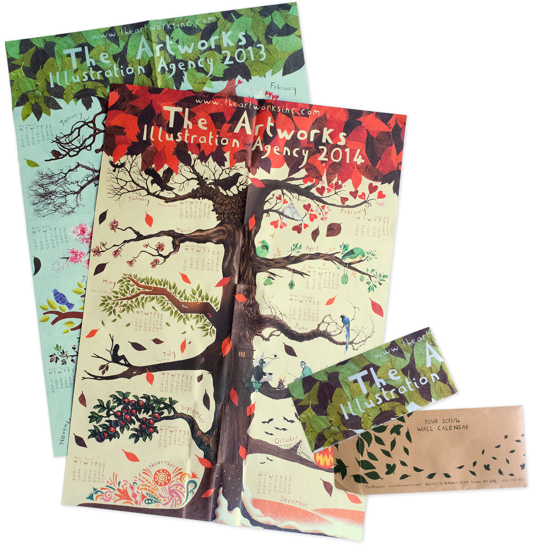
The Artworks
Wall Calendar
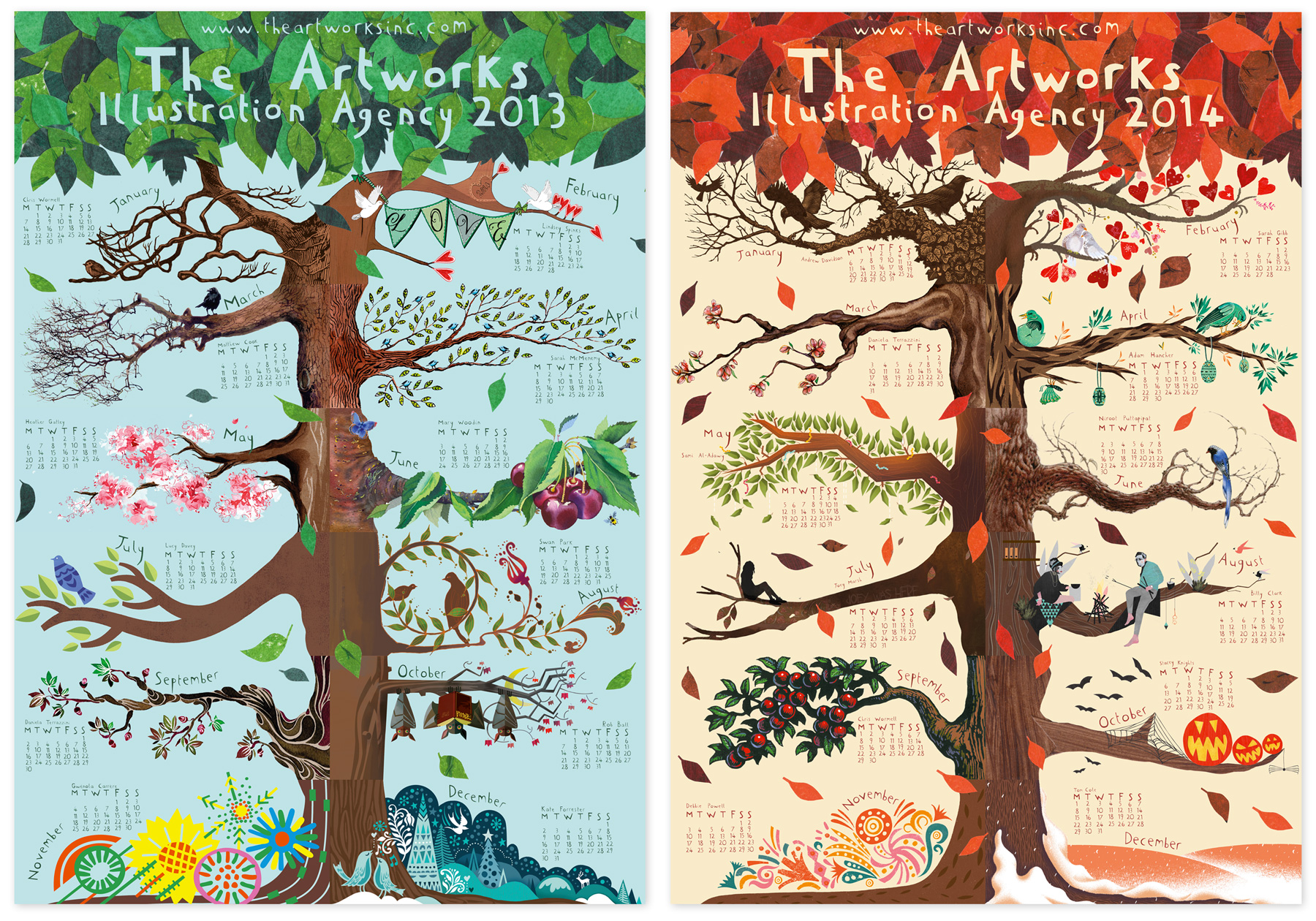
I was commissioned to create this unique two-sided A2 calendar for The Artworks Illustration Agency. Each of the twelve branches features the work of one of their artists: a nice 'year round' showcase for the agency's talent.
The Artworks wanted to find a way to show the work of their artists as individuals but also bring them together collectively to demonstrate the portfolio of the agency. New 'Startworks' artist Stacey Knights played a key role in the design – creating the tree, the canopy of the leaves as well as all of the month names and dates, and the design of the floating leaves on the envelope. My involvement was to work with Stacey and The Artworks to produce a template that went out to each illustrator so that they could create their chosen branch to fit the design and colour palette, but in their own distinctive style. I then completed the output, which included final artwork, some retouching, colour correction, text placement and preparation for print. The calendar is printed on uncoated stock and looks amazing on any wall.
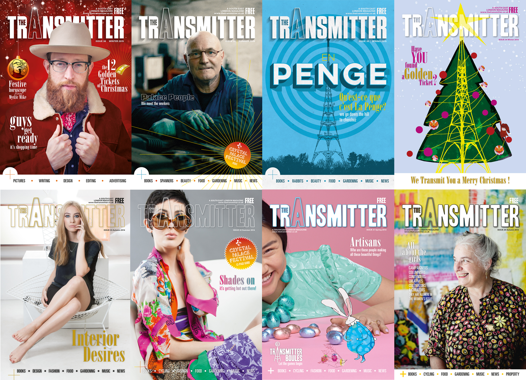
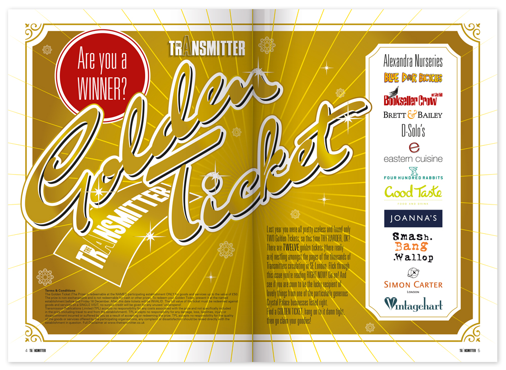
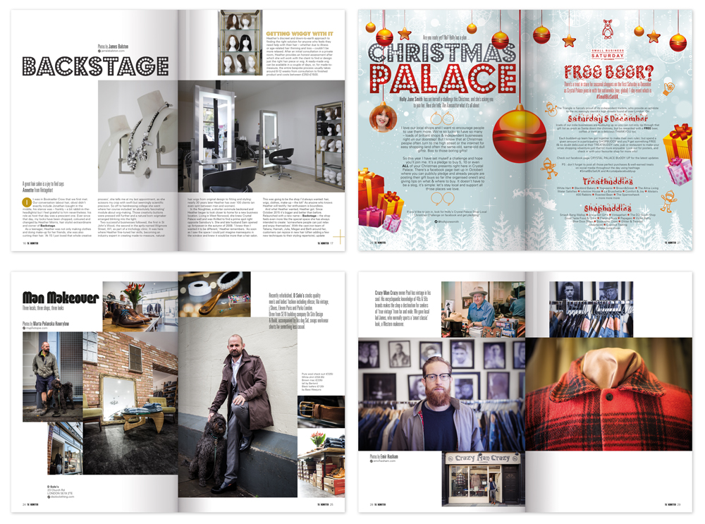
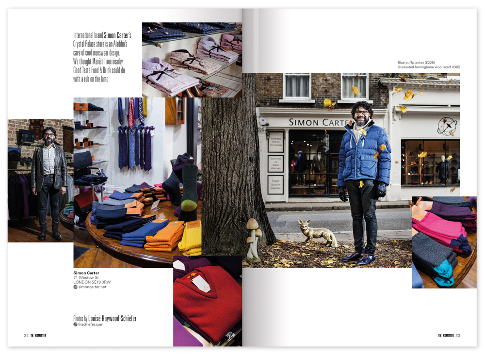
Transmitter Magazine
I design the Transmitter magazine, a high-quality free publication for and about the Crystal Palace area of London. The Transmitter team wanted to refresh the format and typography, while also having the flexibility to allow larger features to have a more bespoke design so that they could stand out within the magazine. The aim was to provide a smart, consistent, good-looking format that could be easily and creatively applied to each issue, building a familiar style but with each issue making its own mark as a one-off.
I looked at the grid structure, and typography. On each issue I work with the editorial team to provide bespoke designs for the main features and the cover. I then complete the artwork and prepare the magazine for print. I also helped to redefine the print spec, and with some simple changes to size and format, helped the team make a significant saving on their print bill without any noticeable loss of quality or content.
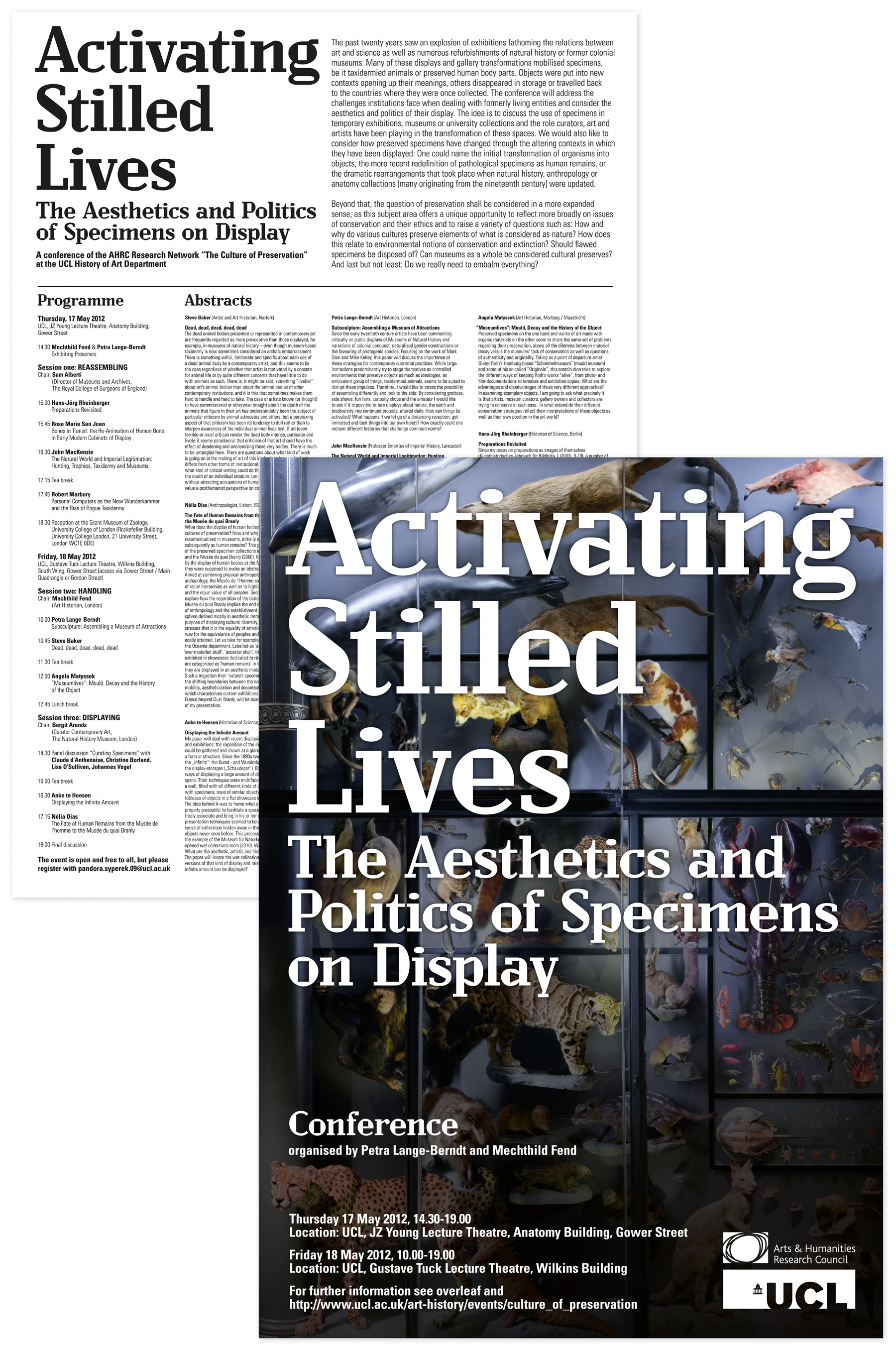
University College London
Activating Stilled Lives: Poster and Exhibition Programme
Design and artwork for an A3 poster and invite to a conference at the University College of London: Activating Stilled Lives. The reverse of the poster lists the conference programme, with abstracts from the forthcoming discussions. The poster folded to A5 so that it could be sent out as a combined invite, information sheet and poster in a C5 envelope.
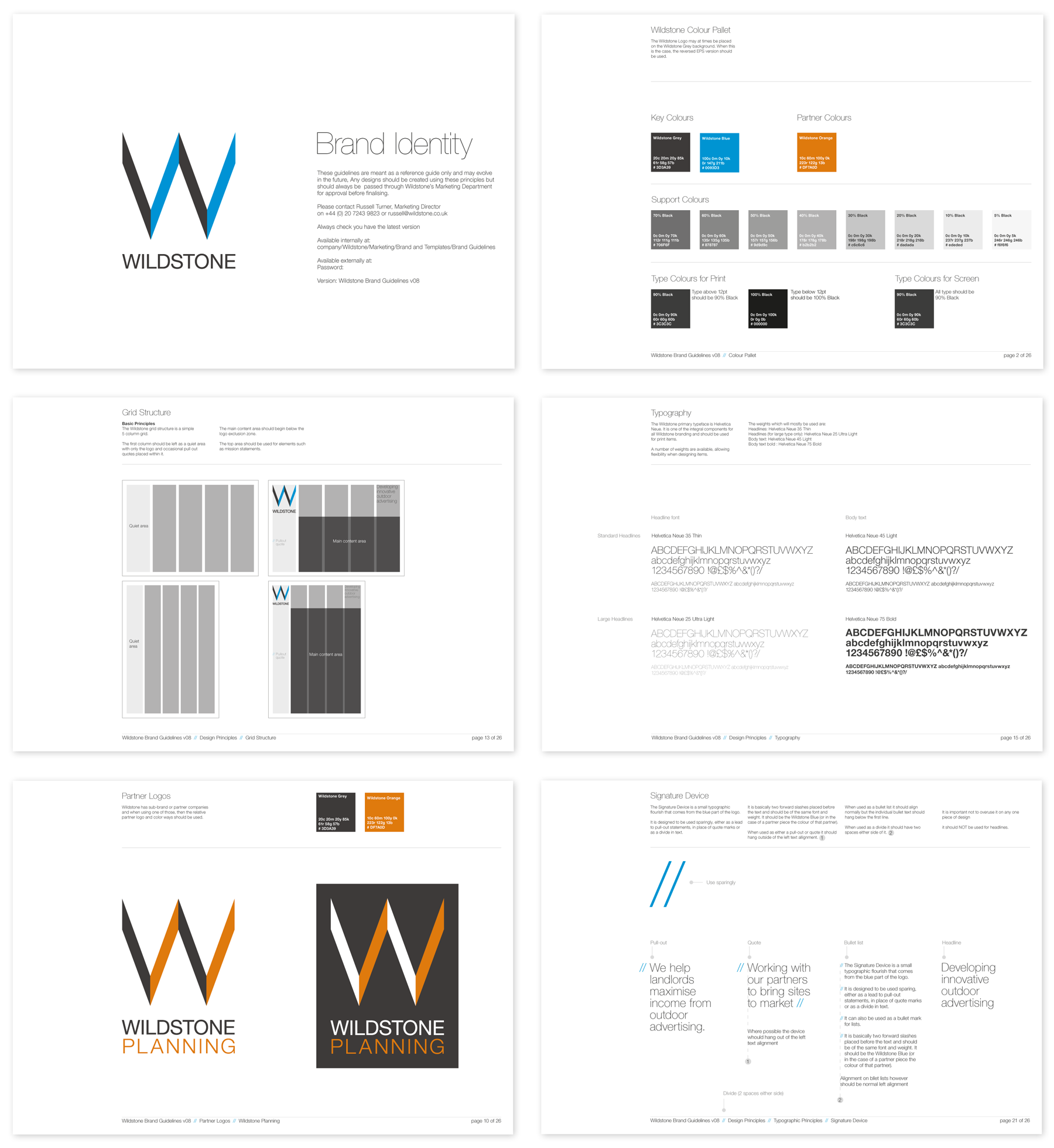
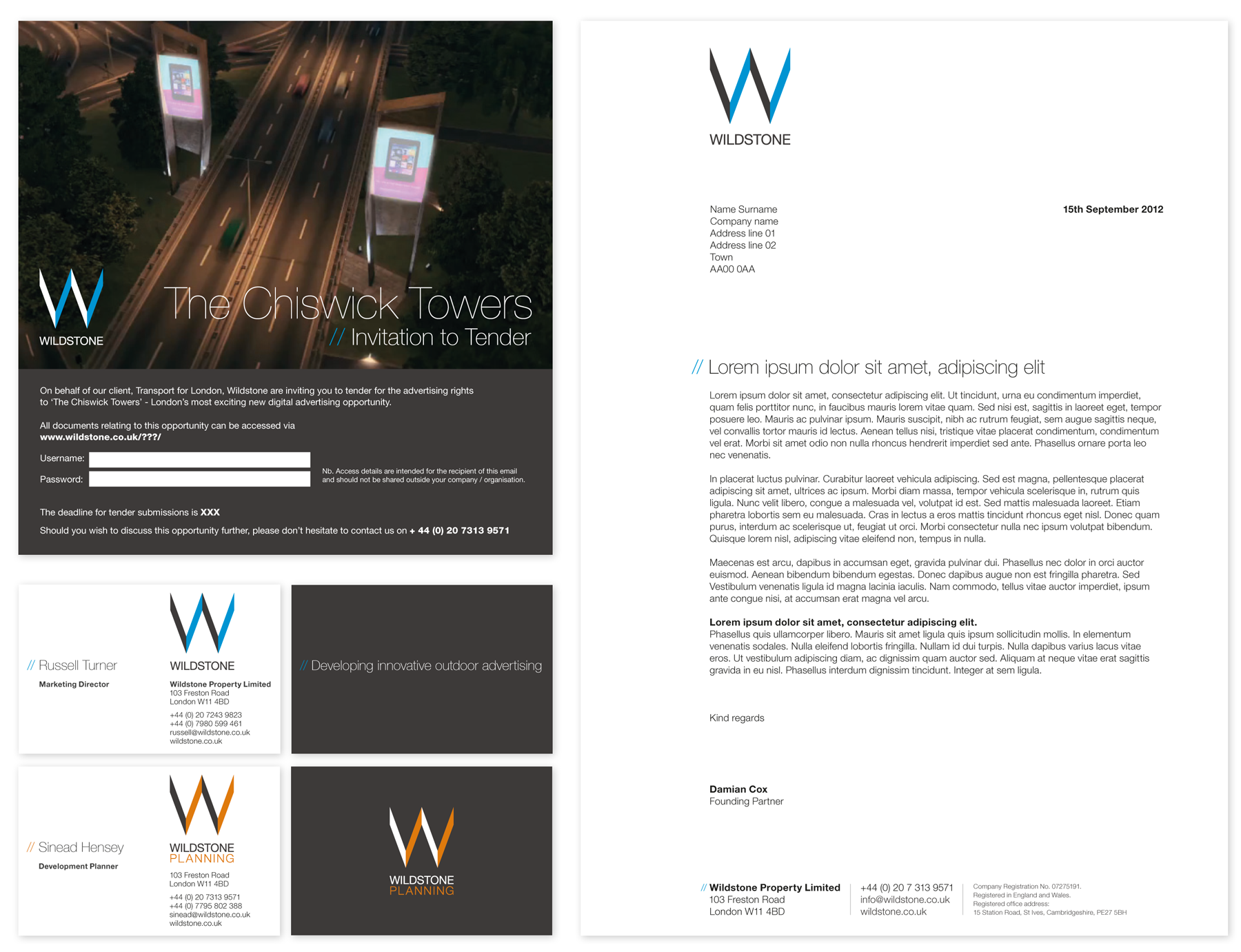
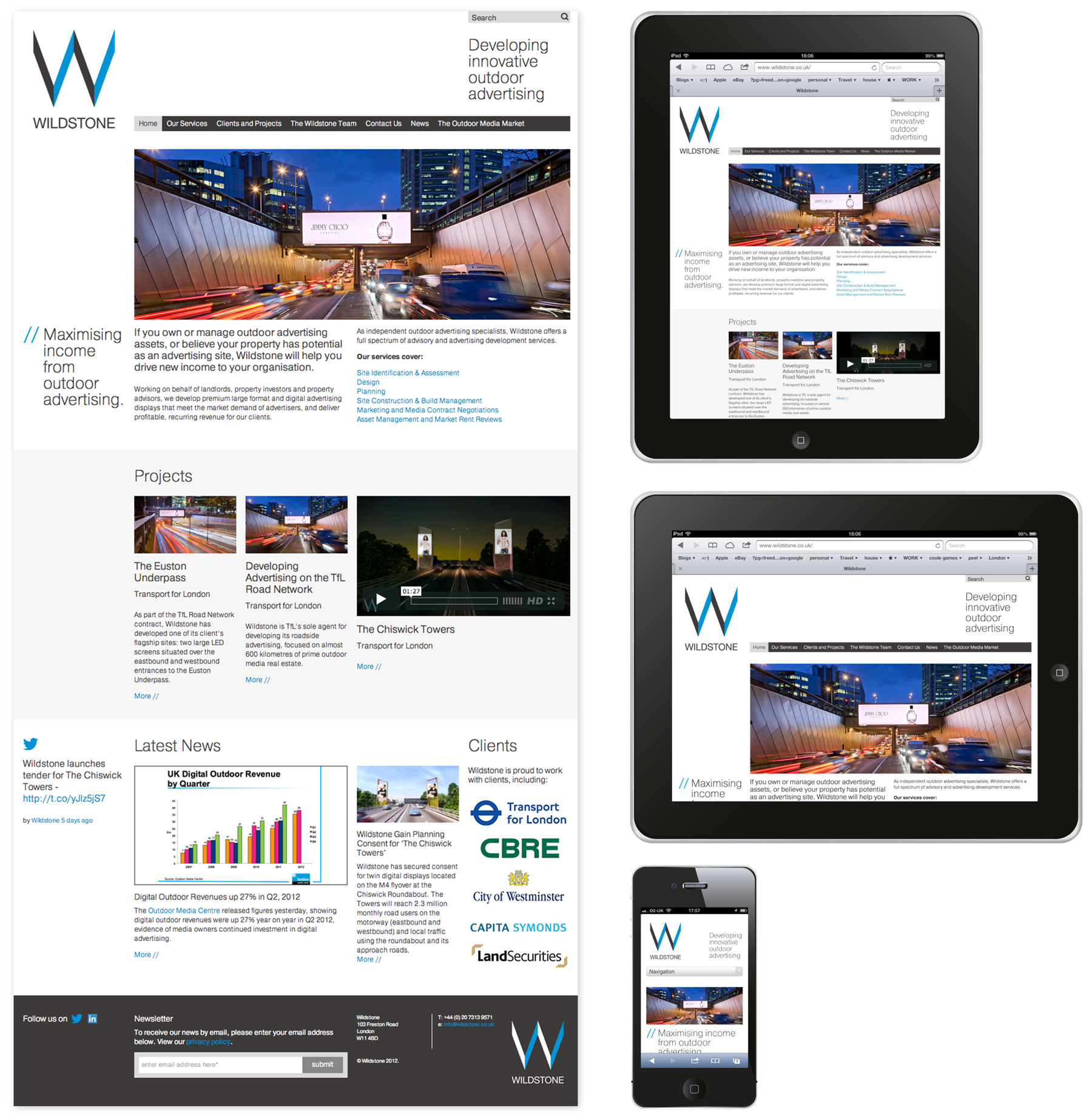
Wildstone Outdoor Media
Brand identity and website
Design for a new visual identity for Outdoor Media Specialists, Wildstone, who develop prime outdoor digital and large format advertising sites, helping landlords and property developers as well as local authorities turn passive spaces into highly desirable media locations.
The brief was to evolve the existing logo and then create a strong visual language that could be used across all their print and digital communications.
The final design uses a tight grid structure, colour palette and use of typography to create a unified identity. The samples below are of the guidelines, stationery, invite and website. The website needed to be a responsive design that could be viewed on various devices and could be updated regularly by Wildstone themselves. Content in Motion and Pragmatic Web were fantastic at following my designs through to final build.